
Ever find yourself staring at a spreadsheet packed with numbers, wondering what it all really means? Adding a Google Sheets line of best fit is often the quickest way to see the story hidden in your data. It helps you visualize the relationship between two variables, turning raw numbers into a clear, predictive trend.
This is the perfect tool for figuring out if your ad spend is actually driving sales, or for forecasting next quarter's performance based on past results.
Why a Line of Best Fit Unlocks Your Data's Story
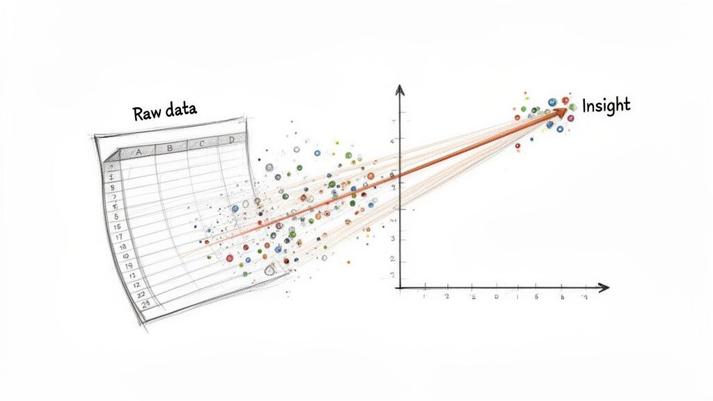
At its heart, a line of best fit—often called a trendline or regression line—is a straight or curved line that cuts through the middle of your data points on a scatter plot. It doesn't just connect the dots. Instead, it reveals the general direction your data is headed. This one line can simplify a complex dataset, making it instantly obvious if there's a positive, negative, or no relationship at all between your variables.
Imagine you have a list of your monthly marketing expenses alongside the sales figures for each of those months. If you just plot the data, it might look like a random cloud of points. The line of best fit slices through that noise to show you the real story.
Turning Data into Decisions
This simple visual is surprisingly powerful for making smart decisions. By analyzing the trend, you can stop just reporting on what happened and start actively predicting what will happen next. A clear, upward-sloping line gives you the confidence to double down on a successful campaign. A flat line, on the other hand, is a clear sign that it’s time to rethink your strategy.
This guide will walk you through everything, from the basics of adding a trendline to a chart all the way to more advanced techniques for deeper analysis. We'll get into how to:
- Quickly visualize trends by adding a line of best fit to any scatter chart.
- Calculate the exact equation of your trendline for precise forecasting.
- Measure the accuracy of your model using the R-squared value.
- Handle non-linear relationships by fitting curves with polynomial regression.
A line of best fit isn't just a statistical feature; it’s a storytelling tool. It transforms a cloud of data points into a clear narrative about cause and effect, enabling smarter forecasting and strategic planning.
Creating a Visual Trendline in Your Scatter Chart
Sometimes, the quickest way to spot a pattern isn't with a complex formula, but with a simple line. Adding a Google Sheets line of best fit directly to a scatter chart is my go-to first step for analysis. It instantly cuts through the noise of individual data points and shows you the underlying trend, which is perfect for both quick analysis and for presenting your findings.
First things first, you need a scatter chart. Just highlight the two columns you’re working with—your independent variable (the one you control, on the X-axis) and your dependent variable (the one you're measuring, on the Y-axis). Then, head up to Insert > Chart. Google Sheets is pretty good at guessing you want a scatter chart, but if it gets it wrong, you can easily change it under the Chart type dropdown in the Chart Editor.
Getting the Trendline to Appear
Once your chart is on the screen, the Chart Editor should pop up on the right. If you don't see it, just give the chart a double-click.
From there, follow this path:
- Click the
Customizetab. - Expand the
Seriessection. - Scroll down a bit, and you'll find a simple checkbox labeled
Trendline.
Check that box, and voilà—the line of best fit instantly appears, slicing right through your data. You can now see the general relationship at a glance.
But a line by itself is just a picture. To turn it into a predictive tool, you need the math behind it.
Displaying the Equation and R-Squared Value
Stay in those Trendline options and look for a dropdown called Label. By default, it's set to None. Change it to Use Equation. The moment you do, the familiar linear equation, y = mx + b, pops up on your chart. This is the engine of your trendline; it gives you the power to predict a y-value for any x-value you plug in.
To really know if you can trust that equation, you need to see how well it fits the data. Right below the Label option, tick the box for Show R². This metric, the R-squared value, is your model's report card. It's a number between 0 and 1 that tells you how much of the change in your Y-variable can be explained by your X-variable.
A higher R-squared value (the closer to 1.0, the better) means your model is a strong fit. An R² of 0.85, for example, tells you that 85% of the movement in your Y-axis data is explained by the X-axis data. That’s a pretty solid correlation.
So, if you were plotting monthly sales against ad spend, you might get an equation like y = 2.5x + 150. That 2.5 slope is a golden nugget of information—it suggests every extra dollar in ad spend could drive an additional $2.50 in sales. You can find a great video guide on interpreting chart equations on YouTube if you want to dig deeper. This visual-first method gives you powerful, actionable insights in just a few clicks.
Key Trendline Customization Options
The Chart Editor gives you a lot of control over how your trendline looks and behaves. Getting familiar with these settings can help you tailor the analysis to your specific needs.
| Setting | What It Does | Why It Matters |
|---|---|---|
| Type | Changes the model from Linear to Exponential, Polynomial, etc. | Linear isn't always best. If your data has a curve, a polynomial fit might be far more accurate. |
| Line color | Sets the color of the trendline. | Improves visual clarity, especially when comparing multiple data series on the same chart. |
| Line opacity | Adjusts the transparency of the line. | Can help de-emphasize the trendline so the underlying data points are still clearly visible. |
| Line thickness | Changes the weight of the trendline. | A thicker line can make your trend stand out in presentations. |
| Label | Chooses whether to display the equation on the chart. | Crucial for turning a visual guide into a functional predictive model. |
| Show R² | Toggles the visibility of the R-squared value. | This is the single most important metric for judging how well your trendline actually fits the data. |
Mastering these few options will take your charting skills from basic to professional, allowing you to not only find the trend but also to validate and present it clearly.
Using Spreadsheet Functions for Deeper Analysis
Visual trendlines are fantastic for spotting patterns at a glance, but sometimes you need to get your hands on the actual numbers driving that line. Maybe you're building a financial forecast, projecting inventory needs, or just need to plug the slope into another formula. This is where you have to move beyond the chart and into the spreadsheet cells to really unlock the power of a Google Sheets line of best fit.
Fortunately, Google Sheets has a set of dedicated functions to pull these numbers directly from your data—no chart required. This approach gives you the raw components of your trendline, the slope and the intercept, allowing you to use them dynamically across your entire workbook. It’s how you turn a simple visual aid into a robust analytical tool.
This quick decision tree can help you choose the right method for your specific goal.
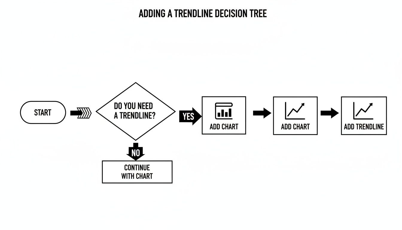
As you can see, for a quick visual analysis, dropping a trendline onto a chart is usually the fastest way to see the relationship and its core equation. But when you need more, functions are the way to go.
The Easiest Route with SLOPE and INTERCEPT
When you're dealing with a standard linear regression, the most direct path is using the SLOPE and INTERCEPT functions. They do exactly what their names imply and are incredibly simple to set up.
Let's say you have sales data in column B (your data_y) and the corresponding marketing spend in column A (your data_x).
- To find the slope (m): In an empty cell, just type
=SLOPE(B2:B50, A2:A50) - To find the intercept (b): In another cell, use
=INTERCEPT(B2:B50, A2:A50)
And that's it. You now have the two key values that define your line of best fit. The slope tells you the rate of change—for example, how many extra dollars in sales you generate for each additional dollar of ad spend. The intercept gives you the baseline value when your x-variable is zero.
The All-in-One Powerhouse: LINEST
While SLOPE and INTERCEPT are great for quick, specific answers, the LINEST function is the real workhorse. It’s an array formula, which means it returns a whole set of values into multiple cells from a single entry. With just one formula, you can get the slope, intercept, R-squared value, and a bunch of other useful statistical metrics.
Using our same sales data, you’d type =LINEST(B2:B50, A2:A50) into a cell. This will immediately return the slope in that cell and the intercept right next to it. To get the full picture, you can use the expanded form: =LINEST(B2:B50, A2:A50, TRUE, TRUE). This version populates a 3x2 table with advanced statistics, including the critical R-squared value in the third row.
The real beauty of
LINESTis its efficiency. It delivers a comprehensive statistical summary of your linear model in one shot. This saves you from running multiple separate functions and helps you quickly validate how well your trendline actually fits the data.
Getting these stats used to be a lot more cumbersome. Before 2020, Google Sheets didn't have an easy way to show the R² value directly on charts, which forced a lot of people into clunky LINEST workarounds. Thankfully, the modern Chart Editor lets you toggle the equation and R² value on with a simple click, giving you instant feedback for linear and even complex polynomial models. You might find that a fourth-degree curve, for example, explains 97.1% of the variance in your data. You can learn more about these advanced charting capabilities to see just how much the platform has improved.
Modeling Curves with Polynomial Regression
Sometimes, a straight line just doesn't capture the whole story. Real-world data rarely moves in a perfect, straight line; it curves, it accelerates, it plateaus.
Think about the early growth of a new product—it starts slow, then suddenly takes off. Or consider a marketing campaign that eventually hits a point of diminishing returns. Forcing a linear Google Sheets line of best fit onto these scenarios isn't just inaccurate; it can be downright misleading.
That’s where polynomial regression comes into play. Instead of the simple y = mx + b equation, a polynomial model adds higher-order terms (like x², x³, and so on) to create a curve that can actually bend and flex to match the true shape of your data. It's the perfect tool for modeling these more complex, non-linear relationships.
Activating Polynomial Trendlines
Switching from a straight line to a curve is surprisingly easy. Once you have a trendline on your scatter chart, just head back into the Chart Editor and open up the Customize > Series section.
Look for the Type dropdown menu—it's set to Linear by default. Click on it and choose Polynomial. Instantly, you’ll see the rigid line on your chart transform into a fluid curve that hugs your data points much more closely.
Once you select Polynomial, a new option called Polynomial Degree will appear right below it. This is where you control the complexity of your curve.
- Degree 2: This creates a simple parabola (an x² term) and is great for data with a single bend.
- Degree 3: This introduces an x³ term, allowing for a more complex curve with two bends.
- Higher Degrees: You can go further, but be careful. Higher degrees can lead to overfitting, where the line follows the noise instead of the underlying trend.
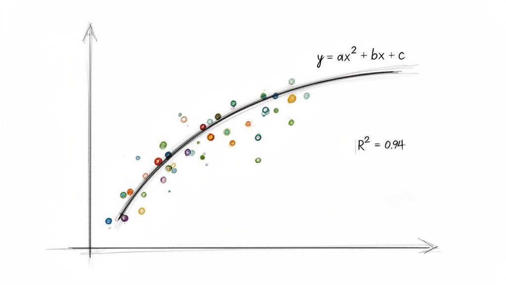
You’ll also see the equation on your chart get a bit more complex to reflect these new terms. More importantly, your R-squared value will almost always jump up, signaling a much better fit.
A big leap in your R² value after switching from linear to polynomial is a dead giveaway that your data has a curvilinear relationship. Don't settle for a lower R² just because the straight-line equation looks simpler.
How to Interpret the R-Squared Boost
The R-squared value, which runs from -1 to 1, tells you how much of the variance in your data is explained by your model. In the real world, a linear model might get you an R² of 0.6 to 0.8. But polynomial models can do much better.
For example, I once worked with a dataset where the linear model gave us an R² of 0.669. By switching to a fourth-degree polynomial, we got that R² up to 0.971. That's a nearly 45% improvement in predictive accuracy. It meant our new curved model could explain 97.1% of the data's variance, making it a far more reliable tool for forecasting. You can find a great walkthrough of how to implement curve fitting in Google Sheets to see these principles in action.
Calculating Polynomials with LINEST
The chart gives you a fantastic visual, but for full analytical control, you can calculate the coefficients for your polynomial equation using the LINEST function. This is a bit more advanced, but it’s incredibly powerful.
To set this up for a second-degree (quadratic) polynomial, you'll first need to create a helper column for your x-squared values. Then, you can feed both the original x-values and the new x-squared values into LINEST as your independent variables.
The syntax looks something like this:
=LINEST(y_range, {x_range, x_squared_range})
This technique lets you build sophisticated predictive models right in your cells, moving beyond simple visuals to create dynamic and highly accurate forecasting tools for any data that doesn't follow a straight path.
Analyzing Large Datasets Without Crashing Your Browser
While Google Sheets is an incredible tool, it has its limits. If you’ve ever tried to chart or run a calculation on a dataset with tens of thousands—or even hundreds of thousands—of rows, you've probably met the dreaded “Page Unresponsive” error. Your browser just wasn't built to handle that much data processing all at once, and it brings your analysis to a grinding halt.
This performance bottleneck is a huge headache for anyone doing serious trend analysis. Trying to get a Google Sheets line of best fit from a massive CSV export can feel impossible as your computer’s fans whir and your browser freezes. Pasting the data in chunks or manually splitting the file is a tedious, error-prone workaround that just eats up your time.
Bypassing Browser Limitations
The real problem is that your local computer is trying to do all the heavy lifting. When you import a huge file, your browser has to parse every single row and cell before it can even display the data, let alone run a function like LINEST on it. A much better approach is to offload that initial processing to a server that's actually designed for that kind of work.
This is where specialized tools come in. They act as a bridge, handling the demanding import process in the background so your browser doesn't have to. The whole workflow becomes much simpler:
- You upload your large CSV or XLSX file to the service.
- The server processes the file and streams the data directly into your Google Sheet.
- Your browser stays perfectly responsive, and the import finishes without a hitch.
This server-side processing method is a total game-changer for large-scale analysis. It separates the tough job of data import from what happens in your browser, making sure that even datasets with millions of rows won't crash your session.
Keeping Your Analysis Automated and Smooth
Once your data is safely in the sheet, the real fun begins. With a reliable import method in place, you can build some seriously powerful, automated workflows. For instance, you could set up a template sheet with all your LINEST, SLOPE, and other regression formulas ready to go. When a new, large dataset is imported, these formulas can automatically calculate the line of best fit on the fresh data without you having to do a thing.
Services like SmoothSheet are built specifically for this exact problem. By handling the import for you, it lets you focus on the analysis itself. This approach keeps your work fluid and scalable, letting you tackle datasets of any size without constantly worrying about your browser giving up on you.
Common Questions About Trendline Analysis
Even with the right tools, digging into a Google Sheets line of best fit can spark a few tough questions. Let's walk through some of the most common head-scratchers that pop up when you go from just plotting a trendline to actually understanding what it's telling you.
Can I Add a Trendline to Only a Part of My Data?
You can, but it takes a bit of a workaround. By default, Google Sheets wants to apply a trendline to the entire data series on your chart. There's no simple checkbox to say, "only look at the data from June to December."
So, you have to get a little clever. The trick is to create a new, separate data series that contains only the subset of data you want to analyze. You can use a formula like FILTER or QUERY in some empty columns to isolate just those specific points.
Once you have that new range, add it to your chart as a second series. You can then make this new series invisible (by setting its point size to none) and add a trendline just for it. Your original data remains untouched, and you get a trendline for the exact period you care about.
Why Is My R-Squared Value So Low?
Seeing a low R-squared (R²) value, like 0.2 or 0.3, can feel discouraging, but it's not necessarily an error—it's a critical piece of information. It simply means that your independent variable (the X-axis) isn't a strong predictor for the changes in your dependent variable (the Y-axis).
Before you write off your model, check a few things:
- Could the relationship be non-linear? A low R² on a straight line might be hiding a very strong polynomial or exponential pattern. Try experimenting with different trendline types in the chart editor.
- Are there outliers? A couple of extreme data points can have a huge impact, dragging the line of best fit away from the actual trend and torpedoing your R² value.
- Is the connection just weak? Sometimes, the reality is that the two variables don't have a strong relationship. That isn't a failed analysis; it's a perfectly valid and often important conclusion.
A low R² isn't a failure; it's a finding. It tells you that other factors, not just the one you're measuring on the X-axis, are likely influencing your results. This is where your analysis should begin, not end.
How Do I Forecast Future Values Using the Trendline?
The equation displayed on your chart is your crystal ball. Imagine your trendline equation is y = 15.5x + 200, where 'x' is the month number and 'y' is your total sales. To predict sales for month 24, you just need to plug that number into your equation.
The math would be y = (15.5 * 24) + 200, which gives you 572. Based on the trend, your model predicts sales will hit $572 in month 24.
If you want to build more dynamic forecasts right in your spreadsheet, the FORECAST function is your best friend. It calculates a predicted y-value based on a future x-value and your existing data, no chart required. The formula is straightforward: =FORECAST(new_x_value, y_data_range, x_data_range).
Working with trendlines gets a lot harder when your dataset is massive. If you've ever had your browser freeze trying to import a huge CSV file, SmoothSheet was built to solve that exact problem. It processes large files on its own servers and streams the data directly into your Google Sheet, so your browser never crashes. You can try SmoothSheet for free and get back to analyzing your data without the technical headaches.